

The colours red and black have long been associated with the city of Ottawa and its various football teams throughout the years. Pay a visit to Parliament Hill or to Rideau Hall, and you will see the Ceremonial Guards donning their traditional black and red uniforms. The Ottawa Football Club, founded in 1876, eventually adopted red and black (and white) as their team colours. This is the team that would become known as the Ottawa Rough Riders in October 1898.
The story behind the Rough Rider name is clouded in mystery. The “official” line is that Ottawa adopted the name Rough Riders as some sort of tribute to future U.S. President Teddy Roosevelt’s regiment (called the Rough Riders) in the Spanish-American War in 1898. But there is no mention of this connection in local newspapers at the time. Why would a football team in Ottawa be named after a regiment fighting a war that had absolutely nothing to do with Canada, anyway? It really doesn’t make much sense.
Another suggestion is that the name derives from the lumberjacks or log drivers who used to ride logs down the Ottawa River. Again, though, there isn’t any reference to lumberjacks or log drivers in Ottawa newspapers around the time the football team started using the name.
Perhaps the Ottawas (yes, they were called that, too) follow the same “rough rider” origins as the Saskatchewan Roughriders. The Regina Roughriders adopted the name in 1924, a reference to the trainers who broke wild horses in the west. In the 1960s and 1970s the Ottawa Rough Riders used a cowboy riding a bucking horse atop a football as their logo. And their mascot was a guy named Okee the Cowboy. So, who knows?
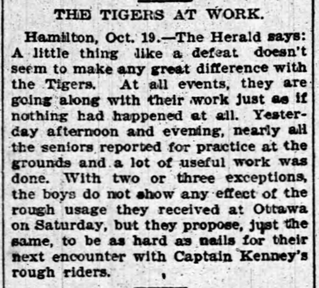
But there is strong evidence that the Rough Rider name given to Ottawa’s football team had nothing to do with a Teddy Roosevelt tribute or lumberjacks or horse-riding cowboys at all. Instead, the “rough rider” label was most likely used as an insult by a Hamilton journalist. See, in October 1898 the Hamilton Tigers and Ottawa Football Club were involved in an intense couple of games that would determine the champion of the Ontario Rugby Football Union. Ottawa had quite the reputation of being an aggressive or “rough” team. Some back-and-forth trash talk between journalists in Ottawa and Hamilton was almost as intense as the on-field rivalry. The Ottawa Journal accused the Hamilton press of maligning their team by calling them “thugs, “murderers, and “rough riders.”

Ultimately, The Ottawa Football Club embraced the insult and began wearing the Rough Rider moniker as a badge of honour. Literally. The team made up pins with the Rough Rider name and distributed them to fans travelling to Hamilton for the second game. It’s entirely possible that the team piggy backed on the “Roosevelt Rough Riders” that were in the news at the time, but the actual origins of football rough riders centred around their reputed rough style of play on the field.


Unfortunately, the Ottawa Rough Riders folded following the 1996 CFL season, ending a 120-year football tradition. In 2002, a new CFL team was founded called the Ottawa Renegades. The Renegades, too, adopted red and black as team colours. However, the Renegades met the same fate as the Rough Riders after playing only four seasons.
It wasn’t until 2014 that the Canadian Football League would return to the Nation’s Capital. There was certainly some support for the new team to be called the Rough Riders. However, Saskatchewan objected to it, and the name didn’t carry the same weight for younger football fans who were either too young or not even born yet to have any recollection of the old Ottawa Rough Riders.
In the lead up to the CFL’s return, fans were asked to vote online for the new team’s name. The options included the Rush, Nationals, Voyageurs, Raftsmen, and Redblacks. On June 8, 2013, the team announced that its new name would be the Ottawa REDBLACKS. The nickname is capitalized for marketing purposes. In French, the team is known as the Rouge et Noir.
The new name was meant with mixed reviews. Detractors suggested it was a made-up word while others pointed to the New Zealand All Blacks, that country’s national rugby team, as an example of a successful moniker named simply after team colours. Surely, Ottawa’s new team could be seen through the same lens.
In the end, football fans in Ottawa rallied around their new team. The Red and Black plays homage to the old Ottawa Rough Riders’ colours, the Ceremonial Guards, as well as the plaid jackets worn by the great lumberjacks of the area. The Ottawa REDBLACKS name sounds like a perfect solution, really. And it sure beats the Ottawa Murderers or Ottawa Thugs, doesn’t it?
A special thanks to Chris Sinclair and Ian Symes who pointed me in the right direction when it came to the origins behind the Ottawa Rough Riders name. Thanks, guys. – RF
Further reading:
https://redandblackrecall.blogspot.com/2021/05/that-whole-name-thing.html
This is the eigth of a series of posts that will explore the stories behind the names of the existing Canadian Football League teams. See the previous post on the Toronto Argonauts.