Blog

  • Remembering the Radically Canadian Marketing Campaign

    In 1996, the Canadian Football League was faced with a dilemma. Having just ended a three-year run of having teams based in the United States, the CFL was retreating north and returning with an all-Canadian lineup. The Baltimore Stallions, the defending Grey Cup champions, relocated to Montreal to become the reborn Alouettes. How could the CFL create an opportunity out of its failed American expansion experiment?

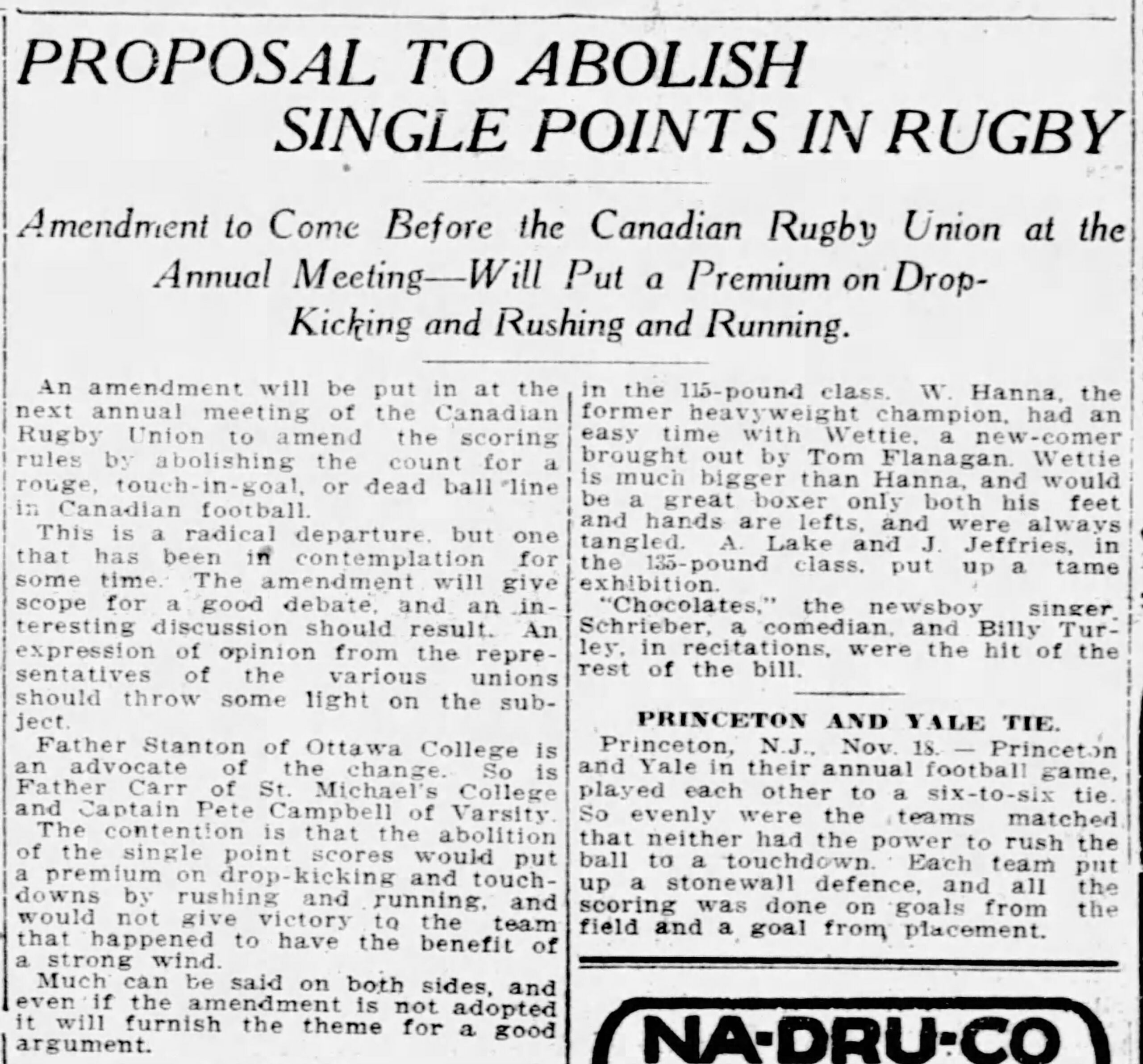
    Go radical. That’s how. As the season was about to kick off, the CFL launched a national “Radically Canadian” marketing campaign that was both patriotic and quite edgy. While “Radically Canadian” instilled a sense of Canadian swagger that was rather rare, the campaign also included slogans such as “We Play By Our Rules”, “It’s Called a Rouge, Get the Point?”, “One Tough Mother”, and the famous “Our Balls Are Bigger.”

    1996 CFL Schedule with the Radically Canadian Logo
    The 1996 CFL schedule featuring the Radically Canadian logo
    (source: Canadian Football Research Society)

    The Radically Canadian logo appeared on the league’s website, publications, and promotional materials. Fans could purchase t-shirts, hats, and sweatshirts from the online “Rad Shop.” There was even a Radically Canadian dance CD produced. You can find these items for sale secondhand on a number of online sites.

    Of course, the campaign wasn’t without controversy. Some found the “Our Balls Are Bigger” and “One Tough Mother” references too risqué.  Some teams didn’t carry merchandise with the slogans for fear of offending customers. And, “Radically Canadian” didn’t translate well into French, causing fears its use could potentially stoke English-French tensions that were running high in the mid 1990s.

    Source: Montreal Gazette, 13 July 1996, page 63 (newspapers.com)

    But, in the end “Radically Canadian” represented a serious effort and investment by an old league looking to reinvigorate itself and broaden its appeal to a younger Canadian fanbase it would need to cultivate for the future. As a marketer and fan, this author gives the campaign a thumbs up. It’s been almost thirty years since the CFL introduced this marketing campaign. Given the current environment, one has to wonder if now just might be a good time to dust off the old “Our Balls Are Bigger” merchandise and once again be “Radically Canadian.”

  • The Edmonton Elks 2.0

    This is the third of a series of posts that will explore the stories behind the names of the existing Canadian Football League teams. See the previous post on the Calgary Stampeders.


    Throughout the long history of Canadian football, there’s been very little controversy surrounding team nicknames. Sure, there was a time in the not too distant past where there was one team called the Rough Riders and another called the Roughriders. But, for the most part the country’s professional football club names have been a bit quirky sounding but certainly not eyebrow raising.

    The one exception to this rule is Edmonton.

    Football has been played in the Alberta capital since 1895. Just as it is today, the early Edmonton team’s main rival was Calgary. The story goes that a Calgary sportswriter took a jab at the Edmonton team by calling them “the Esquimaux” (the French translation of Eskimos) in reference to the rather cold northern Alberta climate. The Edmonton team embraced the insult and used the moniker for a number of years before adopting the Anglicized version of the word in 1910.

    The team was known as the Edmonton Elks in 1922, foreshadowing a name change that would come a century later, and played Queen’s University in the Grey Cup that year.

    The original Eskimo team folded in the 1920s. In 1938, the Edmonton Eskimos were reborn and played in the Western Interprovincial Football Union. However, this team too ceased operations due to the onset of the Second World War.

    It wasn’t until 1949 that the current Edmonton club returned to the WIFU. Once again Edmonton adopted the Eskimos moniker although there were some suggestions that the team be called the Oilers, the name later given to the city’s future professional hockey team.

    For the next seventy years, the Edmonton Eskimos represented Northern Alberta and were considered a model CFL franchise. They won three Grey Cups in a row in the 1950s and won five championships from 1978-1982, an astonishing feat no other team has been able to accomplish.

    However. over time a growing number of people voiced their concern over the use of the name “Eskimos.” Facing mounting public pressure, the team announced that it would be dropping the “Eskimos” name in July 2020.

    A year later, June 1, 2021, the team announced its new yet familiar name: the Edmonton Elks.

  • “Stampeders” New Football Name

    This is the second of a series of posts that will explore the stories behind the names of the existing Canadian Football League teams. Check out the previous post on the BC Lions.


    Conventional wisdom says that the Calgary Stampeders are named after the world famous Calgary Stampede rodeo. The Stampeders moniker has been used by numerous Calgary-based teams over the years in football, hockey, and baseball.

    In the first half of the 20th century, Calgary’s senior football teams included the Tigers, Canucks, Fiftieth Battalion, Altomahs, and Bronks.

    When the Second World War ended, senior football returned to Calgary after a five-year absence. The new club was founded on September 27, 1945 as a cooperative.

    Calgary joined Regina and Winnipeg in a condensed 1945 WIFU season. On October 11, the Calgary Herald reported that the new team would be called the “Stampeders” instead of the Bronks, Calgary’s former WIFU entry.

    One account indicates that the team was called the Stampeders to help advertise “Stampede Beer” produced by the Calgary Brewing and Malting Company (Source: A history of Football in Calgary, Canadian Football Research Society). As a new cooperative money was tight so any source of revenue would be welcomed.

    The newly christened Calgary Stampeders played their first game on October 20, 1945 at Mewata Stadium against the visiting Regina Roughriders.

  • “Lions” New Moniker of B.C.’s WIFU Team

    This is the first of a series of posts that will explore the stories behind the names of the existing Canadian Football League teams.


    In 1953, a group of Vancouver businessmen got the greenlight for an expansion team in the Western Interprovincial Football Union (WIFU). The new team would begin play the following year and play their home games at the new Empire Stadium. Annis Stukus of Toronto was hired to be the club’s first head coach.

    With all the pieces in place, it was time give the new club a team name. A name-the-team contest was held and generated over 15,000 entries. The leading contenders were Lions, Grizzlies, Totems, Loggers, Tyees, and Cougars.

    It ultimately came down to Lions and Grizzlies. The Grizzlies was the name of Vancouver’s earlier entry in the WIFU that played just one season before ceasing operations after the WIFU suspended play as a result of the Second World War.

    Art Mercer and the BC Lions name contest
    Source: The Province, 2 April 1953, page 12.

    Ultimately, a committee settled on the name Lions. Locally, “the Lions” is the name given to twin mountain peaks near Vancouver that are said to resemble mountain lions. So, it was a natural pick.

    The team adopted a mountain lion for its logo and orange and black uniforms, paying homage to another historic Vancouver team, the Meralomas. Annis Stukus wanted to ensure the football team represented the entire province and not just the city of Vancouver. Thus, the British Columbia Lions were born.

    Newspaper article about Lions being the new name of BC's football team
    Source: The Province, 2 April 1953, page 12.

  • The Maple Leaf Forever: An Evolution of the CFL Logo

    It’s been 60 years since Queen Elizabeth II proclaimed Canada’s national flag featuring the prominent red maple leaf. The maple leaf is arguably the most Canadian symbol of all and has been used to represent Canada since the 19th century.

    So, it’s not surprising that this quintessentially symbol of Canadiana has always been featured one way or another in the logo of the Canadian Football League.

    When the CFL was founded in the late 1950s, the fledging league’s logo was what one would expect from the period: an “official” looking crest-like emblem similar to what you would see on an old company letterhead.

    The original CFL logo

    In the 1970s, the league adopted a more modern logo – the classic red maple leaf with the CFL/LCF initials inside a football helmet. Perhaps the CFL took inspiration from the new flag in incorporating the maple leaf into a logo that would span the next three decades.

    Classic LCF helmet logo
    Classic CFL helmet logo

    At the turn of the millennium, the CFL adopted a new logo featuring a stylized slanted maple leaf meshed with a flying red football atop bolded CFL/LCF initials.

    CFL logo adopted in 2000s

    The current CFL logo has been in use since the 2016 season. The maple leaf is minimalized with the focus on an abstract image of a football featuring three hashmarks and the CFL/LCF initials being prominently displayed.

    Current LCF logo
    Current CFL logo

    As Canadians find themselves celebrating the anniversary of their national flag amidst a newfound sense of Canadian patriotism, you have to wonder what may be in store next for the CFL’s logo. Does the league stick with the relatively young status quo? Or, do new opportunities arise for the league to further embrace its Canadian identity and perhaps give more prominence to the maple leaf once again?

    (You can check out more CFL logos at SportsLogos.Net)